Color psychology for web design to invoke emotions
Invoke emotions and target the right audience using colour psychology for web design
We recently read an interesting CreativeBloq article on colour psychology and the emotions colours evoke and we wanted to share it with you.
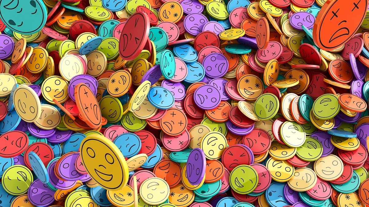
The article explains how colour psychology — the idea that colours can influence people’s emotions and behaviour — can be used effectively in web design to set tone and affect user perception. It emphasizes that colours don’t just make designs look good; they communicate mood and meaning before any words are read. The impact of a colour also depends on its shade or vibrancy: brighter colours tend to feel energetic, while muted tones are more calming. (Creative Bloq)
Then it goes through 12 individual colours and the general emotions or associations they typically evoke:
- Silver – Suggests technology, maturity, wealth, and sleek sophistication. (Creative Bloq)
- Gold – Conveys luxury, success, and exclusivity; best as an accent. (Creative Bloq)
- Red – Bold and attention-getting; associated with passion, urgency, and importance but can be overwhelming in excess. (Creative Bloq)
- Orange – Playful, energetic, and lively, useful for highlights that evoke excitement. (Creative Bloq)
- Yellow – Happy and friendly but can trigger anxiety if too bright. (Creative Bloq)
- Green – Suggests nature, stability, and balance; often linked to outdoors or financial safety. (Creative Bloq)
- Blue – One of the most widely used colours because it signifies serenity, trust, and reliability. (Creative Bloq)
- Purple – Associated with luxury, mystery, and romance; can feel creative or regal. (Creative Bloq)
- Pink – Feminine, young, and gentle, often tied to innocence or softness. (Creative Bloq)
- Brown – Earthy and rustic, conveying sturdiness and natural warmth. (Creative Bloq)
- Black – Powerful, sophisticated, and edgy; great for dramatic impact. (Creative Bloq)
- White – Clean, pure, and simple, and pairs well with most other colours. (Creative Bloq)
The article also mentions grey and beige — grey as neutral or formal and beige as a soft backdrop that accentuates other colours. (Creative Bloq)
Overall, the piece is a practical guide for designers to choose colours intentionally so they set the right emotional tone for a website and resonate with the target audience. (original Creative Bloq article)